When creating websites, two primary approaches to design and layout stand out: Responsive Web Design (RWD) and Adaptive Web Design (AWD). Both aim to provide users with an optimal viewing experience across various devices, but they differ in implementation and philosophy.
| Responsive Web Design (RWD) | Adaptive Web Design (AWD) | |
| Definition | A flexible layout that adapts automatically to any screen size or device. | Predefined layouts designed for specific screen sizes. |
| Implementation | Utilizes fluid grids, flexible images, and media queries in CSS. | Uses static layouts and JavaScript to switch between versions. |
| Examples | 1. https://github.com/ 2.https://www.shopify.com/ca 3.https://www.dropbox.com/ 4.jelizavetaostapjuk23.thkit.ee | 1.https://www.apple.com/ 2.https://css-tricks.com/ 3.https://www.amazon.com/ |
Responsive Web Design (RWD) properties
1. Fluid Grids
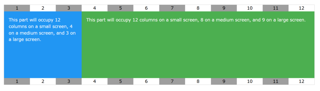
Fluid grids are a key principle of responsive web design. They use proportional values instead of fixed units like pixels, allowing the layout to resize dynamically based on the screen size.
/* Global styling */
    body {
      font-family: Arial, sans-serif;
      margin: 0;
      padding: 0;
    }
    .container {
      width: 90%; /* Fluid width, adjusts to 90% of the viewport */
      margin: 0 auto;
      display: flex;
      flex-wrap: wrap; /* Allows items to wrap to the next line if needed */
    }
    .box {
      background: #3498db;
      color: white;
      padding: 20px;
      margin: 10px;
      flex: 1 1 30%; /* Flexbox properties: grow, shrink, and basis */
    }
2. Media queries
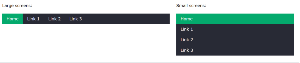
Media queries are a core feature of responsive web design. They allow you to apply specific styles depending on the size or features of the user’s device, such as screen width, height, or resolution.
body {
      font-family: Arial, sans-serif;
      margin: 0;
      padding: 0;
    }
    .container {
      width: 100%;
      margin: 0 auto;
      text-align: center;
    }
    .box {
      background: #3498db;
      color: white;
      padding: 20px;
      margin: 10px auto;
      width: 90%; /* Default: Box takes up most of the screen */
    }

    /* Media Query for tablets (screens wider than 768px) */
    @media (min-width: 768px) {
      .container {
        display: flex;
        justify-content: space-around;
        flex-wrap: wrap; /* Allows wrapping if needed */
      }
      .box {
        width: 45%; /* Adjust to fit two boxes per row */
      }
    }

    /* Media Query for desktops (screens wider than 1200px) */
    @media (min-width: 1200px) {
      .box {
        width: 30%; /* Adjust to fit three boxes per row */
      }
    }
3. Images and media
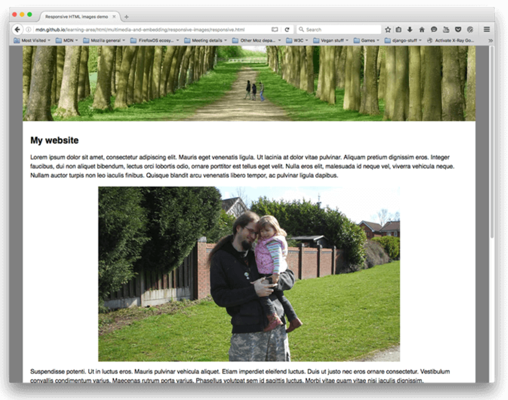
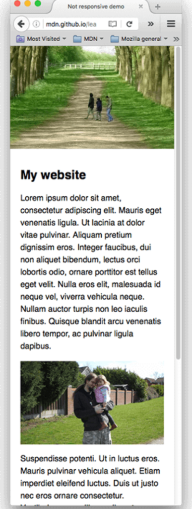
Responsive images and media adapt to different screen sizes and resolutions, ensuring that content looks great on any device. This is typically achieved using techniques like fluid images, the <picture> element, and the srcset attribute.
<!DOCTYPE html>
<html lang="en">
<head>
  <meta charset="UTF-8">
  <meta name="viewport" content="width=device-width, initial-scale=1.0">
  <title>Responsive Images and Media</title>
</head>
<body>
  <div class="container">
    <h1>Responsive Images and Media Example</h1>

    <!-- Fluid Image -->
    <img src="https://via.placeholder.com/800x400" alt="Example Image">

    <!-- Responsive Image with srcset -->
    <picture>
      <source srcset="https://via.placeholder.com/1200x600" media="(min-width: 1200px)">
      <source srcset="https://via.placeholder.com/800x400" media="(min-width: 768px)">
      <img src="https://via.placeholder.com/400x200" alt="Responsive Image">
    </picture>

    <!-- Responsive Video -->
    <video controls>
      <source src="example-video.mp4" type="video/mp4">
      Your browser does not support the video tag.
    </video>
  </div>
</body>
</html>
body {
      font-family: Arial, sans-serif;
      margin: 0;
      padding: 0;
      text-align: center;
    }
    img {
      max-width: 100%; /* Ensures images do not exceed their container's width */
      height: auto; /* Maintains the aspect ratio */
    }
    video {
      max-width: 100%;
      height: auto;
    }
    .container {
      padding: 20px;
    }
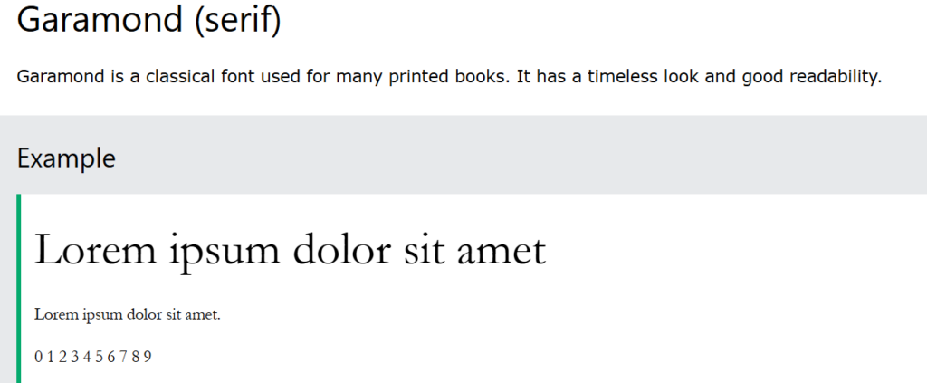
4. Web fonts vs. system fonts
When designing websites, the choice of fonts plays a significant role in aesthetics, readability, and performance. Two common options are web fonts (custom fonts loaded from the web) and system fonts (fonts pre-installed on the user’s device). Each has its pros and cons, impacting design and performance differently.
@import url('https://fonts.googleapis.com/css2?family=Roboto:wght@400;700&display=swap');

    body {
      font-family: 'Arial', sans-serif; /* Fallback font if web font fails to load */
      margin: 0;
      padding: 0;
    }

    .web-font {
      font-family: 'Roboto', sans-serif; /* Custom Web Font */
      color: #3498db;
      padding: 20px;
      text-align: center;
    }

    .system-font {
      font-family: 'Times New Roman', serif; /* System Font */
      color: #2ecc71;
      padding: 20px;
      text-align: center;
    }
Adaptive Web Design (AWD) properties
1. Meta tags
In Adaptive Web Design, meta tags play a crucial role in tailoring the web page for specific devices and screen sizes. The most commonly used meta tag is the viewport meta tag, which ensures the layout is scaled correctly for the user’s device.
<!DOCTYPE html>
<html lang="en">
<head>
  <meta charset="UTF-8">
  <meta name="viewport" content="width=device-width, initial-scale=1.0">
  <title>Meta Tags in Adaptive Design</title>
</head>
<body>
  <div class="container">
    <h1>Meta Tags in Adaptive Design</h1>
    <p>This page uses the viewport meta tag and media queries to adapt to different devices.</p>
  </div>
</body>
</html>
body {
      font-family: Arial, sans-serif;
      margin: 0;
      padding: 0;
      text-align: center;
    }

    .container {
      padding: 20px;
    }

    /* Styles for small devices (e.g., phones) */
    @media (max-width: 600px) {
      body {
        background-color: #f9ebea;
      }
      .container {
        font-size: 14px;
      }
    }

    /* Styles for medium devices (e.g., tablets) */
    @media (min-width: 601px) and (max-width: 1200px) {
      body {
        background-color: #fad7a0;
      }
      .container {
        font-size: 18px;
      }
    }

    /* Styles for large devices (e.g., desktops) */
    @media (min-width: 1201px) {
      body {
        background-color: #a9dfbf;
      }
      .container {
        font-size: 22px;
      }
    }
2. HTML Structure
In Adaptive Web Design, the HTML structure is crafted to accommodate multiple layouts tailored for specific devices. This often includes conditional styles or scripts to load device-specific features while maintaining a clean and semantic structure.
<!DOCTYPE html>
<html lang="en">
<head>
<meta charset="UTF-8">
<meta name="viewport" content="width=device-width, initial-scale=1.0">
<meta name="description" content="An example of adaptive web design using device-specific layouts.">
<title>Adaptive Web Design Example</title>
<!-- General CSS for all devices -->
<link rel="stylesheet" href="styles/global.css">
<!-- Conditional CSS for specific devices -->
<link rel="stylesheet" href="styles/small.css" media="only screen and (max-width: 600px)">
<link rel="stylesheet" href="styles/medium.css" media="only screen and (min-width: 601px) and (max-width: 1200px)">
<link rel="stylesheet" href="styles/large.css" media="only screen and (min-width: 1201px)">
</head>
<body>
<header>
<h1>Adaptive Web Design</h1>
<nav>
<ul>
<li><a href="#home">Home</a></li>
<li><a href="#about">About</a></li>
<li><a href="#contact">Contact</a></li>
</ul>
</nav>
</header>
<main>
<section id="home">
<h2>Welcome to Adaptive Design</h2>
<p>This design adjusts layouts for different screen sizes.</p>
</section>
<section id="about">
<h2>About Adaptive Design</h2>
<p>Adaptive design creates specific layouts for mobile, tablet, and desktop devices.</p>
</section>
<section id="contact">
<h2>Contact Us</h2>
<form action="/submit" method="post">
<label for="name">Name:</label>
<input type="text" id="name" name="name" required>
<label for="email">Email:</label>
<input type="email" id="email" name="email" required>
<button type="submit">Submit</button>
</form>
</section>
</main>
<footer>
<p>© 2024 Adaptive Design Example</p>
</footer>
<!-- Optional JavaScript for enhancing adaptive features -->
<script src="scripts/adaptive.js"></script>
</body>
</html>
3. Media Queries
Media queries in Adaptive Web Design are used to create separate layouts tailored to specific screen sizes or device characteristics. This allows the website to adapt its design without relying on fluid grids or dynamic resizing.
<!DOCTYPE html>
<html lang="en">
<head>
  <meta charset="UTF-8">
  <meta name="viewport" content="width=device-width, initial-scale=1.0">
  <title>Media Queries in Adaptive Design</title>
</head>
<body>
  <div class="container">
    <h1>Media Queries in Adaptive Design</h1>
    <p>This page adapts its styles for small, medium, and large screens using media queries.</p>
  </div>
</body>
</html>
body {
      font-family: Arial, sans-serif;
      margin: 0;
      padding: 0;
      text-align: center;
      background-color: #f4f4f4;
      color: #333;
    }
    .container {
      padding: 20px;
    }

    /* Medium devices (e.g., tablets) */
    @media (min-width: 601px) and (max-width: 1200px) {
      body {
        background-color: #d1f0f0;
        color: #222;
      }
      .container {
        font-size: 18px;
        width: 80%;
        margin: 0 auto;
      }
    }

    /* Large devices (e.g., desktops) */
    @media (min-width: 1201px) {
      body {
        background-color: #e0f7d4;
        color: #111;
      }
      .container {
        font-size: 22px;
        width: 60%;
        margin: 0 auto;
      }
    }
My opinion
In my opinion, Responsive Web Design is the better choice for most web projects. Its flexibility and ability to adapt to any device make it perfect for today’s variety of screen sizes. While Adaptive Web Design can offer better performance for certain devices, the extra complexity in development and maintenance usually makes it less practical.